Images
All the images on the site in one handy place
Search Images
- Share on your website
Share on your website
To include this search on your website, copy the following code and paste it into your HTML:
<!-- Begin Creative Torbay embed code --> <iframe src="https://www.creativetorbay.com/media/images/?month=11&network%5B0%5D=1&page=252&embed=1" width="100%" height="100%" style="min-height:400px;"></iframe> <!-- End Creative Torbay embed code -->
Images / 3766 to 3780 of 7844
Show All / A / B / C / D / E / F / G / H / I / J / K / L / M / N / O / P / Q / R / S / T / U / V / W / X / Y / Z
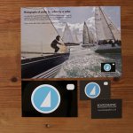
Boatographic Branding
I designed the logo for Boatographic - a marine photographer - based on a camera with a sail in the lens. I used this as the business card and flyer as it lent itself to the size very nicely. When I designed the portfoli.....Read more

Bliss Hair and Beauty Salon Branding
Bliss Hair & Beauty Salon asked me to update and design some print work for them - leaflets, price lists, posters and adverts. I also designed a Christmas Card using the supporting brand graphics and the brand colours. W.....Read more

Zephyr
Zephyr is a fictional sailing association to encourage sailing as a sport for young people. It was a University project and these illustrations were used as part of the marketing material. They all followed the basic bra.....Read more

Ullman Sails Branding
Ullman Sails opened the clothing brand in Plymouth and I designed business cards for both brands - the sailing side and the clothing side. I used silver and spot UV on black for the clothing and the red and blue and spot.....Read more
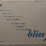
Conviction
A University brief where I was given the poet Stevie Smith and asked to set a poem of my choice expressively. I chose Conviction IV - the most cheerful of her poems! I set the whole poem inside the brackets as a sort of .....Read more

Letterpress Cards
These letterpress cards were part of a University project about greetings cards. I used letterpress and designed greetings cards using expressive typography of lyrics and sayings relevant to the various occasions. ..Read more
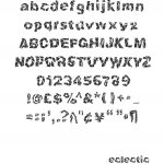
Eclectic Typeface
Eclectic is a typeface based on the Futurist movement and Gino Severini. This started as a University project to design a word based on Gino Severini. I then developed the word (Eclectic) into a typeface - using pointill.....Read more
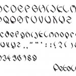
Petallic Typeface
The University brief here was to design a wordmark based on the architecture of the Guggenheim in Bilbao. I designed a wordmark using curved metallic card to emulate the shapes of the building. I then developed a matrix .....Read more
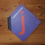
Johnston Journey
This was a University project to design a celebration book - celebrating a typeface. I chose Johnston - the London Underground typeface. I have always loved the art and design based in and around the Underground, it is q.....Read more
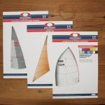
Westaway Sails
I designed a set of specification sheets for each type of sail - including options, extras and materials. These can then be given in paper form or downloaded by the customer from the website, to help them choose the righ.....Read more
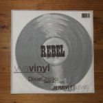
Rebel Magazine
A brief for a University project asking me to design a magazine for Country & Western Music lovers. I tried hard to combine the stereotypical style of the genre with a more contemporary look, and combined the letterpress.....Read more
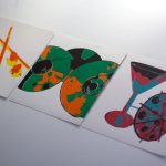
Hanami
This started as a University brief to brand a Japanese Sushi and Karaoke Bar. The screen prints were artwork designed for the bar, and the neon versions were a development on this - looking into the kitsch culture of Jap.....Read more

Daisy Memories Website
Daisy Memories asked me to design a website for the sale of their urns - using the existing logo and based on their Daisy Coffins website. The design needed to be friendly but sombre, and easy for people to use. I used b.....Read more
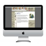
The Duck Company UK Website
The DCUK website - where you can buy wooden ducks direct from The Duck Company UK. I designed the site and it was built in collaboration with ITQ9 using Zencart. We used the branding of the neutral beige and brown colour.....Read more
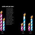
Greener Greetings
I designed these illustrations for a University project about greetings cards and recycling. I used green as the main colour of these illustrations to enhance the message, and kept them simple and easy to understand, to .....Read more
