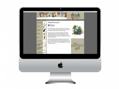
I have been working with Devoncraft and ITQ9 for a while now on the new DCUK website. The previous website had grown with many new products, and it needed to be updated with the new brand colours and typography as well as trying to fit navigation to all the products above the fold.
The navigation on the left hand side had grown so big it carried on down the page so that the user had to scroll to find all the different sections. We kept the colours, the pale beige and the brown, and updated the navigation to try and fit it all above the fold and on every page.
Along the top, the home banner is a slideshow of the welly ducks – not only does the style work well for this size and shape photo, these ducks are also the bestsellers. The photos were all retaken (by me) and use a white background as this not only works well against the neutral brand colours but also shows off the ducks at their best.
I designed the look of the site and worked in collaboration with ITQ9 to get the site up and running. We kept the type big and simple, and kept the text to a minimum where possible to ensure that the site is easy and pleasant to use.
We tried to make it as easy as possible to order each product with the relevant choices and extras – we wanted to keep it similar to the previous site so we didn’t lose any customers, but make it better to use. I was then also able to tie in the new branding for the website into the print work and email newsletters:
It’s still a work in progress but it’s looking a lot better! You can see more of the DCUK print work and e-shots on my website here. You can also visit the DCUK website at: www.theduckcompany.co.uk.
For more information visit http://laurapakoradesign.wordpress.com/2012/01/30/new-work-dcuk-website/

